Thoughtfulness in creating words and visuals helps you to tell an effective story...
Thoughtfulness in creating words and visuals helps you to tell an effective story…
Richard, our art director, discusses the current design trends and how you can use these to help tell your story with maximum impact.
If you’re looking to harness graphic design as part of your marketing efforts this year, then we hope reading more about these trends will help you when considering how you’re going to effectively elevate customer experiences and perceptions of your business. These are the top 10 graphic design trends to watch in 2020.
Design, by its very essence, cannot exist in a vacuum.
Cultural, political, economic, social and technological developments all have an impact on, and are impacted by, effective design.
Design shapes visual communication and in today’s networked and information-rich society, it is more important than ever before, that you work in collaboration with a design agency which puts significant thought behind their creativity… thoughtful creativity if you will…
Design is never neutral – consider this when you ponder the trends below.
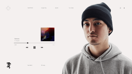
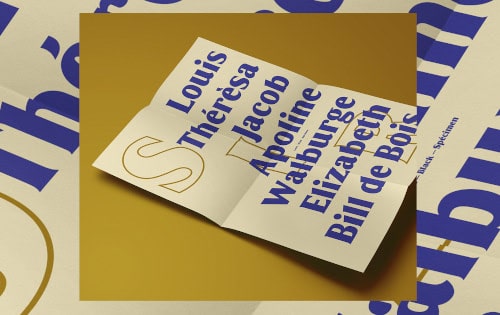
Words matter. They matter even more when they are set in a type which grabs attention. Expect 2020 to see bold typography to continue to be a major trend as copywriters and designers team up to create loud, dramatic typographic titans which dominate a design and leave an impression.
Big, bold headlines are already supplanting photography and imagery with clever, concise copy being given space to breathe and convey their message within typographic-centric designs.
Don’t expect the trend towards bold typography to be limited to any one particular format, towards the end of 2019 we were seeing bold typography creeping into websites and print collateral, and with 2020 now rolling along, bold typography is finding creative applications within email and direct mail campaigns.
Designs must function – be it conveying a message or imparting information – but ultra-minimalism seeks to break a design down to its most essential elements.
“Less is more” has become a well-worn phrase to describe minimalist design aesthetics, but as the ultra-minimalist trend takes hold through 2020, expect this phrase to be supplanted by the more radical “subtract until it breaks”.
Rooted in the philosophies of minimalist artists such as Donald Judd, Carl Andre and Robert Morris, ultra-minimalism will see designers in 2020 pushing at the rational limits of the approach, stripping all excess and experimenting with tiny typographic nuances such as kerning and leading to pull-in, disorientate and then reorientate the viewer.
Colour takes on an added significance within ultra-minimalist designs. Ultra-minimalist designs may restrict themselves to a simple black-and-white palette, but other ultra-minimalist designs we’ve spotted play with broader colour ranges. With fewer design elements on the page, colour gains influence. Colour choice becomes a critical element within the overall design.
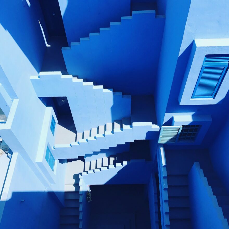
At the other end of the design spectrum sits ultra-maximalism, an exuberant, extravagant design aesthetic filled with bold letter forms, image collages, 3D distortion.
In short, it’s about embracing excess.
You’ll find very little, if any, white space.
It can be argued that maximalism arose in reaction to minimalism. In the same way, the rise of ultra-minimalism has provoked a reaction in the form of ultra-maximalism.
It’s not merely a reactionary aesthetic however.
Ultra-maximalism can trace its roots back to the dawn of advertising – particularly following the explosion of colour lithography in the 1870s. The ultra-maximalism of 2020 draws upon more contemporary sources such as the work of Peter Max, David Carson and Stefan Sagmeister.
Today’s ultra-maximalism comes at a time when audiences are saturated with content, advertising and media. Ultra-maximalism accelerates this development – flooding viewers with a hedonistic excess, introducing bleeds, textures and even luxury elements such as metallic inks, foils and custom die-cuts.
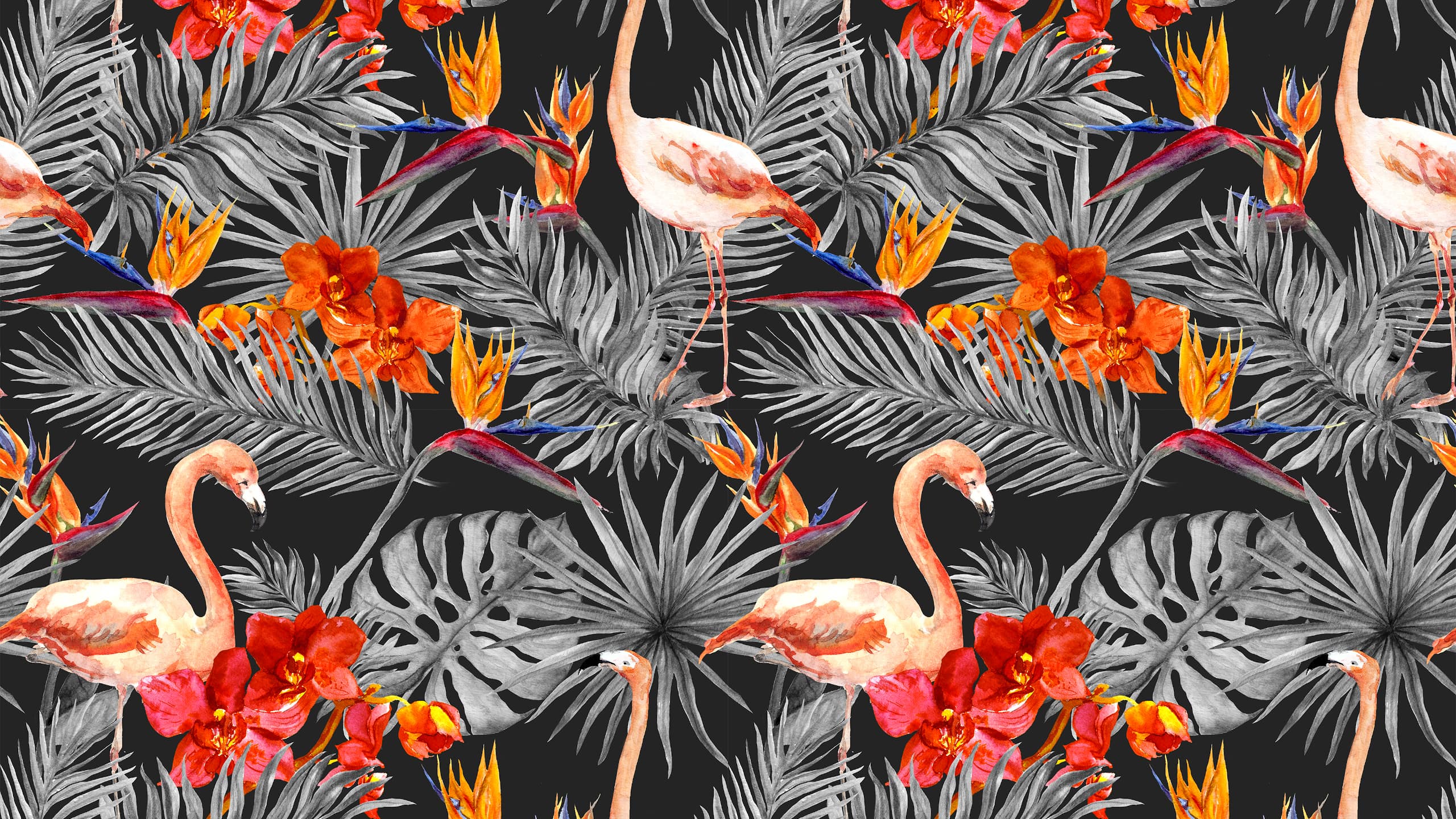
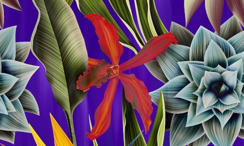
Not necessarily a new trend for 2020, but rather one which is finally reaching widespread acceptance. Neons, fluorescents and bright vibrant colours will dominate the palettes of designers as they strive for their designs to stand out in the wash of content both online and offline.
In digital applications, we’re expecting to see bold colours married to subtle gradients as a means of bringing the colours to life in contrast to the monolithic blocks of colour which dominated late-2019.
As brands compete for attention, 2020 could well see something of a ‘colour arms race’. Colours not seen in nature, strikingly vibrant and luminous hues will seep into designs injecting an element of cyberpunk futurism to otherwise everyday products and services.
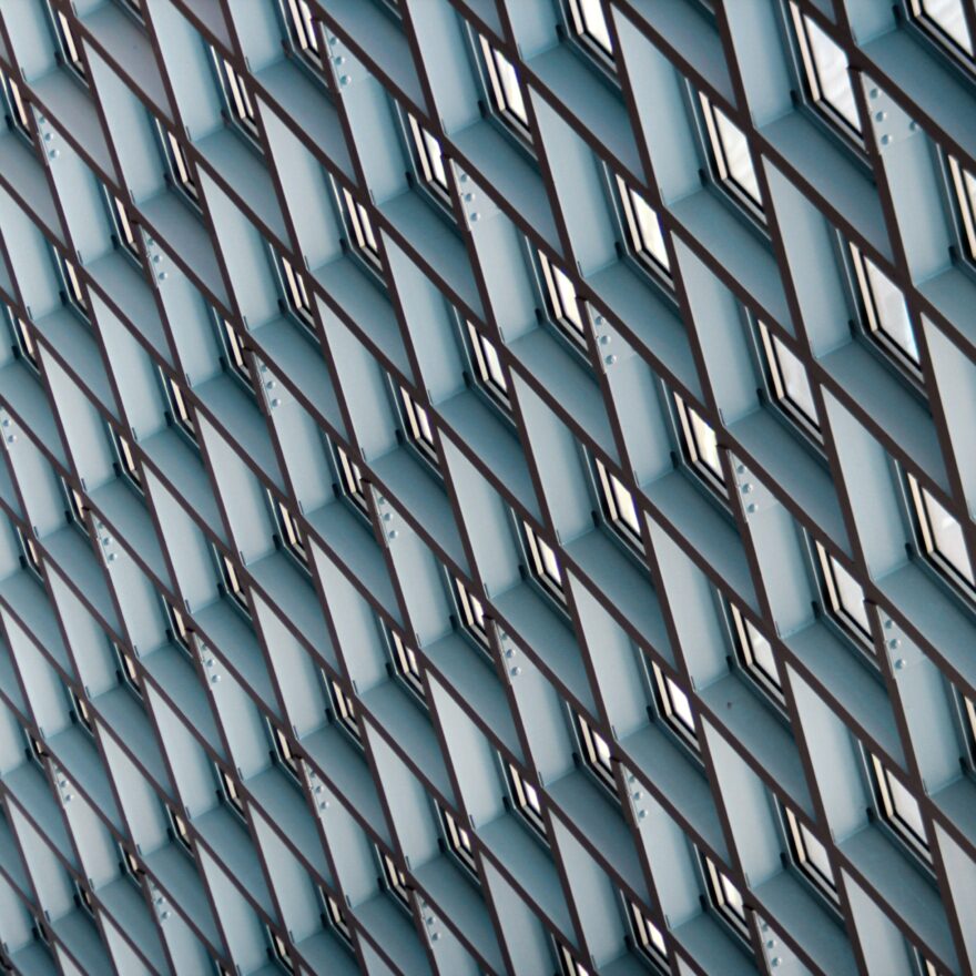
What is it that defines the form and nature of an object?
Lines.
Whether these lines are curved or geometric determines to the viewer whether they are natural or artificial.
2020 may be the year that sees ambitious designers merge the two line styles to create unusual, impossible shapes. Shapes that confuse or agitate the viewer, but shapes which grab and hold attention.
Ultra-Thin Geometry has found widespread acceptance in the industrial, electronic and computer industries, but 2020 may see the style adopted by a broader array of industries. Combining stable geometry with flowing liquid curves provides a futuristic aesthetic which remains rooted in the present – a style which will hold strong appeal for many brands.
In-line with the emergence of ultra-thin geometry, line art is going to have a good 2020.
This year will be a breakout year for line-art, which during 2018 and 2019 was restricted to minimal application in designs, but is now flourishing into full-blown illustrations and line art patterns and designs.
Line art compliments minimalistic and flat design aesthetics well and we’re beginning to see novel applications of line art across both print and digital. We’re also expecting to see line art move beyond logos and icons (its traditional application) in 2020 and into patterns that become a more central part of an overall design approach.
If you’re looking to convey an idea by blending both text and image into a unified whole then make sure you’re lined up to take advantage of the line trend in 2020.
Competition. It’s a word which haunts the dreams of many a business leader (whether they like to admit it or not). For businesses which operate in crowded marketplaces, (and who doesn’t these days?) differentiation is key. And you can’t get much more different than using typography that is completely unique to your brand.
For large brands, and especially those with a global presence, font licensing can be a tiresome, complex and expensive headache. Instead, 2020 will likely see brands investing in custom typefaces so that they can simultaneously stand out from their competitors and save money.
Getting custom typography right can be more of a challenge than it first appears. You have to consider what you want your font to say about your brand, the contexts and mediums in which it will be used and a whole constellation of other factors.
Don’t worry though, there’s a thoughtfully creative agency which can help you with that.

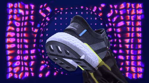
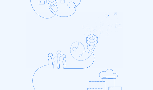
In a world swamped with content that is shallow or uninteresting, isometric illustrations have become a significant design trend thanks to their ability to add depth and motion to what would otherwise be a flat design.
Isometric illustration has been around for a while, but 2020 will be the year it evolves into fully animated videos and gifs for digital use. Moving from more basic styles, isometric illustrations will feature super-realistic 3D elements, greater depth, realistic lighting and shadows. Colour palettes will change too. Moving away from cartoonish hues, isometric illustrations will be swathed in cyberpunk, futuristic colours such as purple, turquoise and blue.
Another emerging and related trend is that of isometric typography. Bringing copy to life and making key messages stand-out, isometric typography is increasingly being utilised to add 3D elements to otherwise flat design spreads. Isometric typography adds another perspective to a design and can skew a viewers perception, giving designers another element to play with in the ongoing search for ‘visibility’ in a content-saturated world.
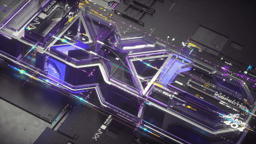
3D design approaches were huge in 2019, and they’re not going to fade away in 2020. Over the year ahead we’re likely to see 3D graphic design compositions combined with other formats such as photographs and 2-dimensional objects. This combination of dimensions is an attempt to harness the best of flat minimalist design with the visual complexity and uniqueness of 3D realism.
When executed well, 3D designs can give viewers reason to pause and dwell upon the design in front of them. Whilst flat, minimalist design is easy to digest and interpret, 3D design invokes a sense of curiosity and wonder which makes the viewer ask ‘how did they do that?’
If 2020 is all about standing out from content saturation, then 3D should be in your design armoury.
Monochrome is another design approach which has been around for a number of years, but 2020 is the year we expect this trend to really hit its stride. In particular, in combination with ultra-minimalism and ultra-maximalism, monochrome will be taken to its radical conclusion by bold designers this year.
Aside from being eye-catchingly simple, monochrome creates harmony – because it’s drawn upon a single base colour, wielding a range of hues, tones and shades. In application, monochrome has been used really effectively on photos and within partial elements in graphic composition.
Design matters. When considered correctly, with thought and intelligence, it can make a hugely positive contribution to your business. From improving user experience and product perception to communication and messaging, thoughtful creativity can be impactful.
If you’d like to find out how design can deliver for you and your organisation, then drop us a line!